The Pantone Color Institute announces a “Color of the Year” annually, and for 2025, the chosen shade is “Mocha Mousse.”
As per color psychology, colors and hues are determinants of human behavior. Colors have a quality that can influence perception and evoke particular feelings in people. Our human brain tends to react to colors by triggering emotions and memories.
Colors play a remarkable role in marketing and branding, helping companies effectively connect with their customers and successfully convey their beliefs. This article enables you to explore more about color psychology and how you can strategically implement it in branding and marketing.
How can color psychology be used strategically in branding?
Choosing a color is the best method to develop a powerful and significant visual identity that reflects your brand identity, appeals to your audience, and differentiates your brand from the competitor. One of the most effective ways to arouse specific emotions in your target audience’s hearts and thoughts is color.
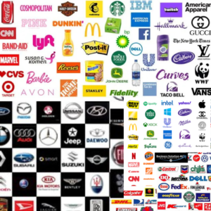
Color plays a major role in purchasing decisions, considering your brand. Research indicates that customers cite color as a primary reason for choosing one brand over another.
In light of this, color psychology governs all aspects, including your brand and the logo you choose for your brand. It helps to drive your unique look to your brand’s total experience across all platforms. Color is the basic visual stimulus in the human sequence of cognition, especially when it comes to the brand storyline you wish to communicate to your target audience.
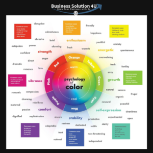
Color Psychology Chart
The above-mentioned chart gives you a quick glimpse at the meaning of the world’s most popular colors. Context and culture do matter; however, according to the study, these are the emotions that tend to be related to each color.
Therefore, whether you’re picking colors for branding, marketing, or advertising, the quick reference guide can assist you in selecting the shade that best conveys the meaning of your message.
Understanding the psychology of colors is imperative in branding and marketing, as top brands demonstrate their powerful influence. Though these responses differ based on context and culture, marketing colors have a psychological connection, depending on how they are used. A smart color choice guided by a brand’s positioning and personality helps to engage its audience more effectively.
How Colors Influence Branding?
Colors and emotions are interconnected. Let us find the details of how color psychology works:
Color Psychology of Red
It is a useful color for branding; however, it requires careful use as it has a profound emotional effect. As seen by clearance sale tags and their feeling of excitement and urgency, red is perfect for grabbing attention in advertising because it helps to stimulate reactions and decrease analytical thinking.
It holds a range of feelings such as anger, danger, aggression, passion, energy, and strength.
It has both positive and negative associations, such as power, romance, warning, and appetite stimulation. It also indicates test scores or sports achievements.
Color Psychology of Orange
It is a blend of red and yellow, a vibrant color that stimulates the feeling of warmth, excitement, and enthusiasm. It is often used in sports branding and to capture attention, as seen in website buttons and traffic cones.
Home depot brands mainly try to explore the orange color, as it is connected with values. Along with referring to warmth and seasonal imagery like sunsets, citrus, and pumpkins, summon up feelings of comfort, especially throughout the fall and Halloween seasons.
Orange conveys positive qualities like courage, confidence, and enthusiasm; conversely, it also evokes negative connotations such as frivolity, immaturity, and irritation.
Color Psychology of Yellow
Despite its volatile nature, it is a striking color that is often connected to warmth, pleasure, and optimism. It is also used in warning labels, traffic signals, and advertisements.
However, yellow may induce negative feelings like frustration, fear, and anxiety. Along with its inability to be visually processed, it can even cause nausea and distress, such as causing babies to cry.
When it is used properly, it increases self-esteem, even though excessive use can have an impact on discomfort. So that makes use; it is used at a moderation level.
Color Psychology of Green
As it is the most visually soothing color, it is calming and balanced, making it perfect for promoting relaxation, such as in a “green room” for performers.
Green embodies nature, health, growth, and opulence. It is well known to enhance vision and help with night vision because eyes feel sensitive to its shades.
It carries a sense of safety, vitality, and progress but also holds negative associations like envy, stagnation, and illness.
Green is an adaptable color in branding that blends its positive and negative traits, reflecting harmony and freshness.
Color Psychology of Blue
The color of mind is tranquil, calm, peaceful, and widely favored, especially among men. More than 33% of brands use blue as their primary color, as it is a conservative and non-threatening option because of its ubiquity in nature, from the skies to the water.
Blue symbolizes security, loyalty, and trust. It is widely used in financial sectors and is conducive to productivity in the workplace.
In addition to that, blue transmits feelings of melancholy, coldness, and unappetizing quality. So that you can rarely see food branding.
Weighting its positive aspects of reliability and serenity with its adverse connotations, blue remains a secure and adaptable branding color.
Color Psychology of Purple
It is a blend of red and blue. Red symbolizes energy, and blue holds calmness. This strikes a balance between warmth and coolness influenced by whether red or blue dominates.
It is rare in nature to make it feel special but sometimes artificial because of its royalty, wealth, and sophistication.
Purple’s wavelength inspires imagination and creativity by connecting it to time, space, and spirituality.
Being associated with wisdom, refinement, and luxury, it can elicit introversion, extravagance, and moodiness reflecting its complex and diverse nature in branding and marketing.
Color Psychology of Magenta
Unlike red and purple, magenta combines sophistication and pragmatism. It symbolizes both physical harmony and emotional equilibrium.
It promotes the embrace of novel concepts by expressing empathy, self-respect, and transformation.
Magenta is perfect for creative and unconventional endeavors because of its boldness inherited from red. It can look either shocking or imaginative.
Its dynamic and adaptable nature in branding reflects its psychological connections that include positive traits like passion, innovation, and balance as well as negative qualities such as impulsiveness, eccentricity, and flippancy.
Color Psychology of Brown
It is black mixed with red and yellow color. Brown combines the black in good proportion with a warm, earthy tone.
It honors authenticity, reliability, and practicality by extracting the dependability of nature and materials like wood and leather.
Men usually choose brown; it may be sophisticated when utilized well, as shown by classic leather products. Nevertheless, it can also symbolize conservatism, heaviness, and melancholy.
Brown radiates warmth and comfort, but it should be used carefully to prevent coming out as bland or monotonous.
Color Psychology of Black
Black is the absorption of all colors. It is timeless and stylish, symbolizing power, sophistication, and authority. It outlines energy and focus while conveying a sense of power and depth.
However, on the other part, black holds an ominous sense, representing sorrow, menace, and evil.
In addition to good relationships like security and elegance, it also implies dictatorship and coldness, which depict its longevity in branding and psychology.
Color Psychology of White
White is the reflection and lacks all the hues. It symbolizes simplicity, cleanliness, and purity.
In modern designs like Apple and in a few healthcare brandings, white is often utilized to signify elegance and sterility indication.
It reminds of freshness and a fresh start, like a clean slate; it is related to innocence and simplicity. White indicates both purity as well as a possible cause of enmity. It is valued for its clarity and vastness; yet, if adapted too much, it could become frigid, isolative, and empty.
Tips for Picking Your Brand Colors
- A color that authentic to your brand
- A color that embodies your brand personality
- A color that appeals to your audience
- A color that differentiates your brand
Conclusion
Color psychology is one of the best and approved marketing strategies for branding. It specifies an exact method for engaging the audience, expressing feelings, and developing brand identification. Every color has varied psychological meaning – from red’s fire and urgency to white’s simplicity and purity. Strategic color use may give an unforgettable visual identity, greatly influence customer behavior, and reinforce the brand message.
Nevertheless, context and culture play a remarkable role in interpreting these colors. So it is crucial to select colors for branding and marketing. By picking colors authentic to your brand personality and appealing to your target audience, you can craft a unique and powerful brand presence that resonates on all platforms.


Leave a Reply